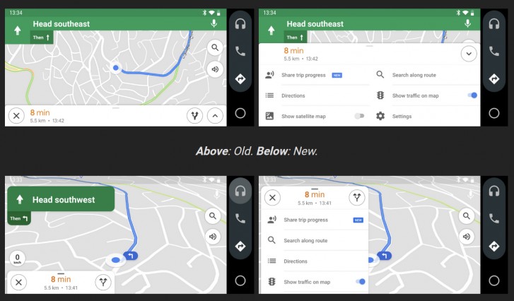
The new update has got refresh appearance with new buttons and floaty signs and menu. Now the direction and sign showing users the way have rounded corners and are smaller in size so that they take less space. In this way, users are able to see the map in the back easily. Moreover, the new update has made landscape navigation better. Now the direction will not take the overall height of the screen and poping up settings menu will also not cover the whole screen. There were rumors that the Android Auto standalone app will be removed however it stayed on Play Store for long and getting new updates clearly shows it’s not going anywhere soon. To get a compatible in-car experience, anyone can download Android Auto. Here’s the comparison of the new and old interface so that people can differentiate:
Photo credits: GSMArena Moreover, to enjoy the new interface, you will have to update the app from google play store or will have to wait longer for the app to get updated automatically with the appearance. Also Read: Now See Preview of Google Maps Dark Mode Via Search App
